You may not be old enough to remember back to the days when an album cover was practically a novel. Okay, maybe not that extreme, but if you take a trip back to the 1950s, you’ll notice that album covers were all about the text. Big, bold letters telling you everything you needed to know about the music inside. There was a reason for that, but we’ll get to that later.
Fast forward a few decades, and album covers became the very definition of art—sometimes abstract, often symbolic, and always designed to grab your attention in a record store.
So, how did we go from wordy descriptions to iconic symbols like the Rolling Stones’ famous lips? How did album covers evolve from literal to legendary? It’s a Renaissance-style journey through time, culture, and a shifting sense of what’s cool—and trust me, it’s a trip you’ll want to take. Let’s dive into the visual evolution of album covers, from the word-heavy 1950s to the art-centric 60s and 70s and beyond, and see how they became essential to a band’s branding and identity and the symbolism of an ever-changing society.
As I mentioned earlier, back in the 1950s, the concept of an album was still relatively new. Vinyl records were just becoming popular, and with this new format came a new way to market music. Back then, album covers weren’t about being cool or artistic—they were practical. The cover had a job to do: it had to tell you what was inside and make you want to buy it.
Take Marty Robbins’ Gunfighter Ballads and Trail Songs as an example. The album cover is text-heavy, listing out every song and making sure you knew exactly what you were getting.
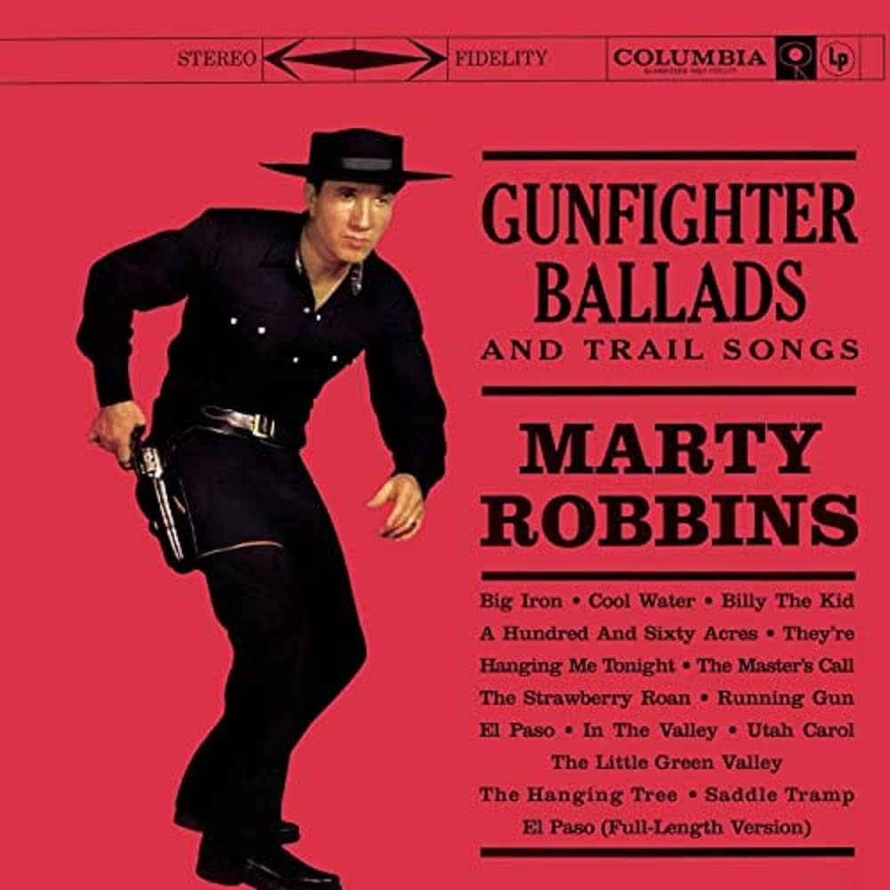
The studio was trying to sell you the record by overwhelming you with information. At that time, this was the norm. People were buying records without ever hearing the songs, so they needed all the details upfront.
And you can’t talk about 50s-era albums without mentioning Frank Sinatra’s In the Wee Small Hours from 1955.
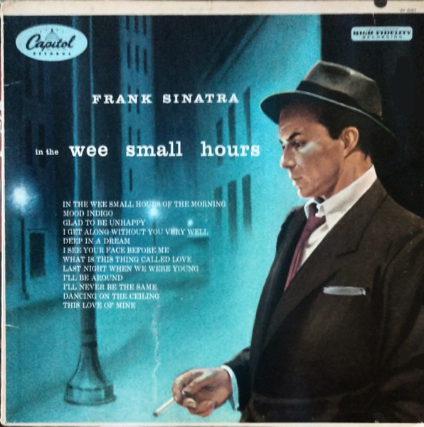
This is the album that many believe started to break the “word-heavy” mold. This was a much more moody and atmospheric cover, but it still leaned heavily on Sinatra’s image to sell the record. But it was clear: we were now moving into an era where the musician and the marketing were becoming one entity.
But more changes were coming. As the 1960s rolled in, something shifted. The music scene started to change—rock and roll, jazz, and eventually psychedelic rock began to take over the airwaves, and with this shift came a new way of thinking about album covers. They weren’t just there to tell you what songs were inside; they were an extension of the music itself—a piece of art meant to evoke a feeling or set a mood.
The Beatles were pioneers in this new approach with Sgt. Pepper’s Lonely Hearts Club Band. The cover was a bold, colorful collage that felt like a snapshot of the era itself.
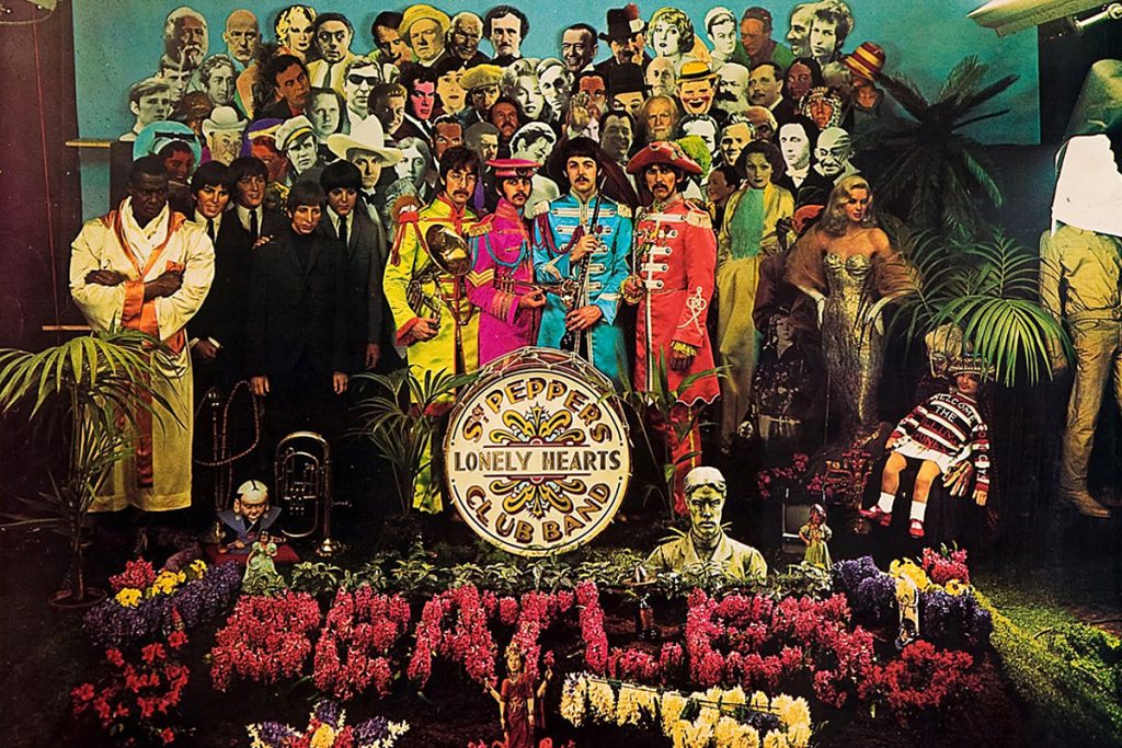
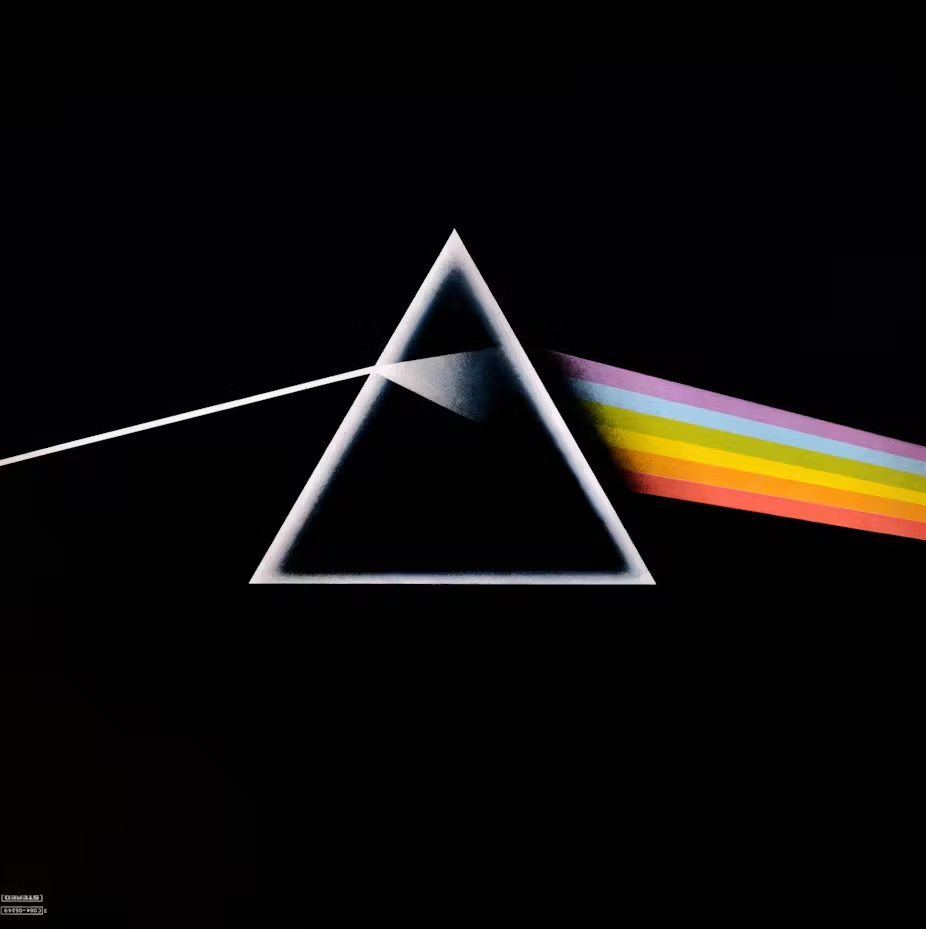
It was no longer about listing songs or selling you on the artist; it was about making a statement about social issues, society, drugs, exploration, and maybe even politics. Around the same time, artists like Pink Floyd were pushing the boundaries even further with The Dark Side of the Moon—a cover that was as mysterious and mind-bending as the music inside.
It didn’t take long for album covers to go from painfully spelling out what was inside to throwing down some seriously abstract, surreal imagery.
The Beatles’s Revolver cover art is a perfect example of blending surreal imagery with band identity.
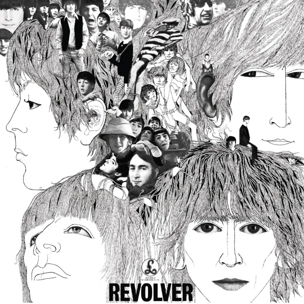
The goal was to capture your imagination before you even dropped the needle. It was all about creating a visual identity that stuck with you long after the music stopped.
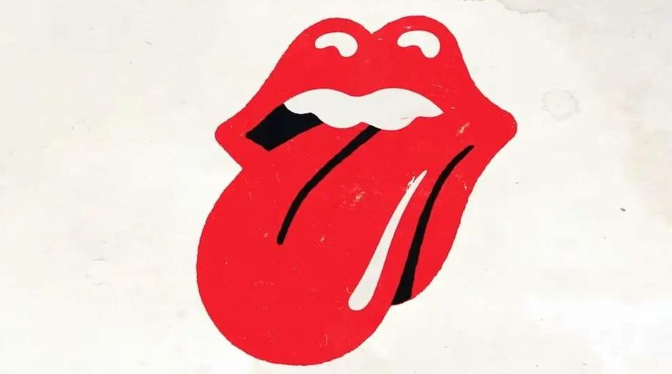
But then something very interesting happened. Bands began forming “logos” to make their music and their brand stand out even more. It was almost like turning rock music into a corporation. And nobody did that better than The Rolling Stones with their magic lips. Of course, that wasn’t the technical term. Here’s the history:
The tongue and lips logo or alternatively the lips and tongue logo, also known as the Hot Lips logo, or the Rolling Stones Records logo, or simply the Rolling Stones logo, is a logo designed by the English art designer John Pasche for the rock band The Rolling Stones in 1970.
This trend stuck, and many other bands that followed started creating logos to help identify their band and their brand:
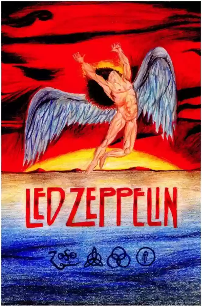
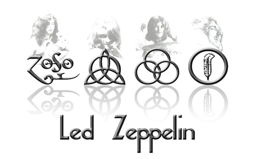
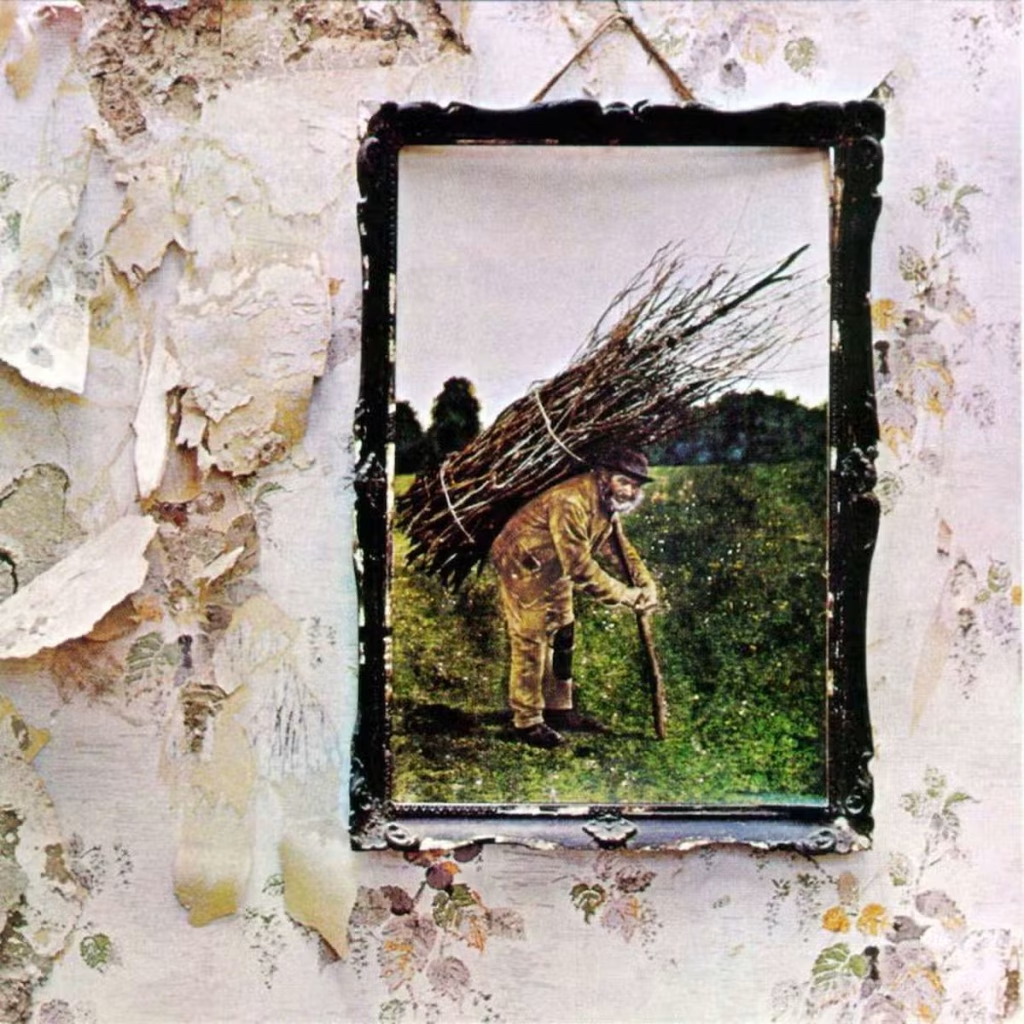
Led Zeppelin – The band is associated with a set of four symbols, each representing one of the members. These symbols were used prominently on their album Led Zeppelin IV and have become iconic.
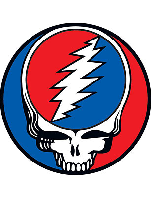
The Grateful Dead – Their Steal Your Face skull and lightning bolt logo is instantly recognizable and became a symbol of the band’s culture and fanbase.
AC/DC – The band’s simple yet powerful logo featuring bold letters with a lightning bolt has become synonymous with rock and roll energy.

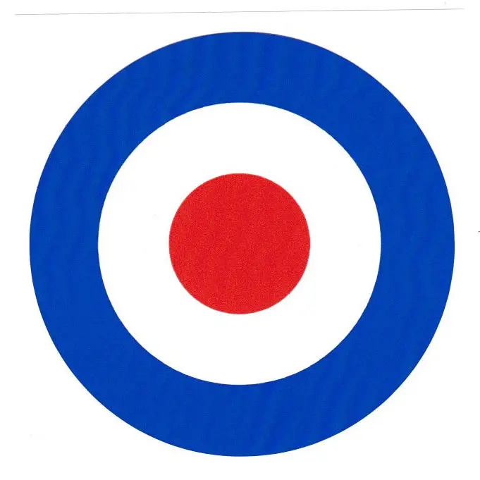
The Who – Their “target” logo, with the band’s name superimposed over a mod target symbol, has become a significant part of their identity.
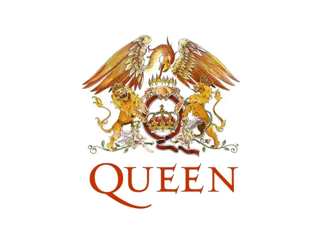
Queen – The band’s elaborate “Queen crest,” designed by Freddie Mercury, features the zodiac signs of the band members and has been used consistently on their albums and merchandise.
Metallica – Their angular, jagged logo with its distinctively sharp “M” and “A” has become an iconic symbol in the heavy metal community.

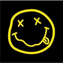
Nirvana – The band’s “smiley face” logo, with its crossed-out eyes and wavy mouth, is instantly recognizable and has become a symbol of 90s grunge culture.
Guns N’ Roses – Their logo featuring two revolvers wrapped in roses has become emblematic of the band’s blend of hard rock and glam elements.
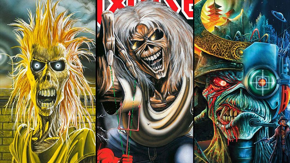
And we can’t talk about band logos without mentioning Iron Maiden, who created a mascot named “Eddie” who became the creepy crawly face of the band.
These logos, like The Rolling Stones’ iconic lips and tongue, are way more than just images—they’re the visual heartbeat of these bands, instantly recognizable to fans worldwide. They didn’t just define the band; they made them marketable in a world that was quickly becoming all about consumerism.
As the 1970s rolled into the 80s, album covers became less about abstract art and more about branding. More and more bands started to realize the power of a strong logo or symbol—something that could be instantly recognizable and easily associated with their music, and at this point, album cover art didn’t need to explain anything—it was the brand and the art that told the brand’s story.
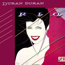
One group that did this very well was British pop rock band Duran Duran. Their branding became tied to famous American artist Patrick Nagal, from Dayton, Ohio, who spent most of his life in the Los Angeles area.
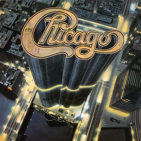
In this era, album covers became an even more crucial part of a band’s marketing strategy. The goal was to create a visual identity that was as strong as the music. Whether it was the minimalist designs of bands like Led Zeppelin or the elaborate, logo-centric covers from bands like Chicago, the focus was on creating something that would stand out in a record store and be instantly recognizable.
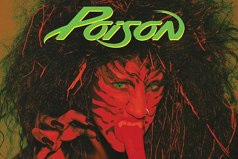
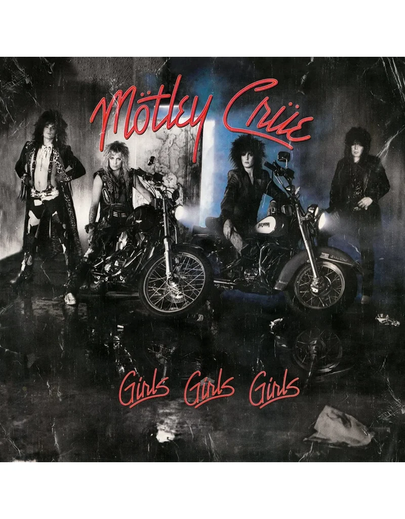
Album covers in the 80s also started to reflect the growing influence of MTV. With the rise of music videos, image became more important than ever. The album covers became an extension of the music videos that were taking over pop culture. And nobody did this look better than the 80s hairbands.

The album cover was just the tip of the iceberg in a band’s visual identity—think music videos, concert posters, and all the merch your heart could desire. It was all about building a cohesive brand that you could sell across every platform imaginable. Bands were turning into mini corporations, raking in cash from every angle. But it was the album cover that played the biggest role—like the alluring department store window, giving you a sneak peek at all the goodies waiting inside. It’s honestly a little heartbreaking to see albums fading into the background, because album art was like the Renaissance of the music world—a time when visuals and sound collided to create something truly iconic. It was more than just a cover; it was a full-blown artistic revolution where music and art came together in this powerful, unforgettable way. Losing that feels like losing a piece of that magic, where every album was a masterpiece waiting to be discovered.
Even so, the evolution of album covers from the 1950s to the 1980s is more than just a journey through graphic design and photography—it’s a reflection of how music, culture, and marketing have changed over time. What started as simple, text-heavy designs meant to inform evolved into abstract art that challenged the listener’s perception, and finally, into powerful branding tools that defined entire generations.
Today, even in the digital age, album covers still matter—but let’s be real, they don’t pack the same punch they did back in the vinyl heyday. Sure, they’re still part of the music experience, but they’re not the visual feasts they used to be. Maybe that’s why vinyl is making a comeback—people miss that tangible, immersive art that was practically a piece of the music itself. It’s about more than just making an impression; it’s about bringing back the magic that once made album art iconic.
And let’s be honest, collecting digital album covers just doesn’t hit the same as holding vinyl in your hands. Sure, scrolling through digital art isn’t the same as flipping through a stack of records, but the modern versions still nod to a time when music and art were one—and that makes them pretty cool.
Till next time, be wickedly wonderful.
Cool Beans! Lotta memories there:)